This time around, I thought I would take you behind my design process on a poster make over project I worked on for the Family Medical Group. The original article maybe seen on
Creative Latitude, GRAPHIC-make overs web site.
A brief background: The Family Medical Group is a hospital in a community that is majority Latino and low income families. They are a fairly large hospital, they have 3 locations plus a joint partnership with 3-4 other independent hospitals. Which brings it to anywhere in the neighborhood of 20-30 hospitals.

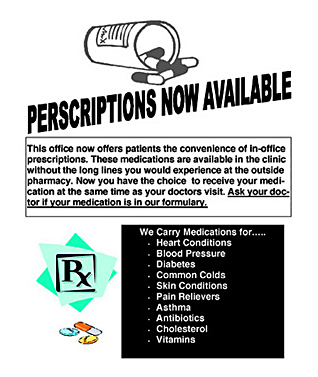
As you can see from the original, it needed a redesign badly. It's a very plain with little to no color or graphics to draw any attention to it. They were not getting much responses to the posters or to their services. They wanted me to punch up the poster and convey a clear message.

The poster needed some color or graphics to grab your attention. Using Images of prescription drugs, as a focal point, then leading your eyes outward and down to the copy. The challenge was not going too crazy with the design and colors. Being a hospital, I had to keep it a little more conservative. Chosing colors that would draw attention but also colors that would balance out the design. Using varying shapes and sizes give the design some movement.
In the end, I think, I came up with something that works. A three-column grid allows the type to flow more smoothly and to give more flexibility as well as more interest to the page layout.
Labels: Design, Marketing, Poster Make Over, Promotion
